© 2035 by The Clinic. Powered and secured by Wix
Don't Burn is an animated short film about a rookie magician's performance, which turns into a mystical odyssey through the depths of performance anxiety. Unravelling before the audience's eyes, the magician's anxious journey becomes a spectacle of both awe and concern. The film explores the topic of young artists grappling with high expectations, fear of judgement and self-doubt.
Animatic of Don't Burn - a work in progress
MY ROLE
VISUAL IDENTITY & MY VISION
As the art director, I was responsible for the visual identity of the film. This included making environmental concepts, stylistic choices, designing backgrounds, the colour script and exploring the possibilities of using traditional hand-drawn animation together with digital.
For me, Don't Burn was an exploration of the human psyche, and emotions which are often overlooked in contemporary society, which I am fascinated by in my general work. With my backgrounds and art direction, I aimed to create resonant worlds, which allows the viewer connect to the story, and delve into the mental turmoil of the main characters. I am particularly fascinated by the interplay between characters and their environments, and how this dynamic shapes their behavior and interactions.

A background from Don't Burn

A background from Don't Burn
THE THEATRE

The film is set in mid-20th century London, in a time past the great era of magicians Houdini, Kellar and Thurston. When designing the theatre, I wanted to show the past glory and popularity of the theatre with an ornate and opulent exterior, demonstrating its character: conservative, reserved and snobbish. By doing this, I aimed to create the theatre as another character in the film, in its own right looming over the protagonist and establishing a reason for his anxiety from the start.

Early exploration sketches of the theatre design
PERFORMANCE HALL
When creating the performance hall I wanted to highlight and clarify the interplay of the protagonist’s delicate performance and the audience's disinterest and boredom, which would consequently foster the magician's anxiety and incite paranoia - a key event in the film.
The theatre, which once housed great artists and magicians, was now declining in popularity.
It resorted to converting the theatre into a theatre-bar, staging over-the-top performances to make ends meet and in result attracting similarly inclined patrons.
Overall design choices:
-
The performance hall design draws inspiration from a Cabaret Theatre or a Cabaret Bar, a theatre which offers drinks alongside performances.
-
Traditional theatre seating is changed into dining tables.
-
Alcohol and cocktail glasses can be seen to emphasise the dual nature of the venue.
-
Posters of Cabaret performances seen in the background.
-
The colour palette consists of deep reds, browns, and gold - emphasizing the conservatism and former luxury of the theatre.
-
The dark colour values and dim lighting create an intimate atmosphere, evoking a feeling of closeness with the protagonist.
-
Subtle noise textures in the background create a vintage look.


THE DRESSING ROOM
The dressing room is an environment we find ourselves in after the cut from the first scene - the daydream. Here, the colours switch from vivid and bright to gloomy and dim indicating the protagonist is back to reality. This room, gives us more insight into the protagonist's emotional state and the theatre:
-
Scattered cards on the floor display frustration
-
Ashtray with cigarettes show anxiety
-
Feather fans and cabaret poster gives more information about the theatre's performances


Poster designs for environments

Card design

Lamp exploration - design hinting time setting
USING 3D FOR 2D BACKGROUNDS
Around the time of the storyboarding phase for the film, we realised that we needed to think of ways to accelerate the production rate of the storyboard and the backgrounds. By constructing the 3D environments first, we saw that we could streamline the workflow easier:
-
3D layouts helped the storyboarding process because we were then able to generate many different perspectives and camera angles without the need to redraw the environment manually.
-
consistent spatial relationships helped with consistency and readability
-
backgrounds were made marginally faster because of the many layouts we had which were true-to-perspective
But there were also some challenges that came with this approach:
-
the blend of stylised 2D and precise 3D models had to be seamless to avoid visual dissonance - I tackled this by only using the layouts mostly as a guide and made sure to use textures and brushstrokes to my advantage.
-
instead of doing 2D painting over the 3D layout, I also thought about using those 3D layouts for backgrounds on their own. This would include texturing every asset and rendering each background which would have been very time-consuming, so I decided not to.


3D layouts for the backgrounds

One of the first versions of the storyboard - without 3D layouts, made by Alekos Recchia and I


Later storyboard shots - with 3D layouts
THE COLOURSCRIPT
I aimed to use light, colour and atmosphere to echo the magician's emotional journey through the scenes. I used the colour script to track the magician's emotional state and looked at how colour and light can support the mood of the film. Besides this, fire becmes a pivotal element when guiding the viewer through reality or nightmare.
Don't Burn begins with vivid and bright first scene indicating a daydream which is suddenly interrupted when the protagonist awakens in a dimly lit desaturated dressing room. Later on, as the protagonist moves toward the stage, the lighting shifts to a dominant green, showing the theatre's superiority over the bunny and his growing anxiety about his coming performance. During the performance, the fire turns from warm yellow and orange to unnatural pink and blue signaling the protagonist's descent into paranoia and nightmare. These colours dominate during the peak of the film. And finally, when the protagonist is awoken from the nightmare once again, a warm, pink lighting surrounds him, offering a sense of hope as his spirits lift.

The Colour Script

The Colour Script together with important story beats

Fire colour progression

Background of the hallway - painted by Olive Vermeulen and I


Initial colour and lighting tests of the hallway - made in Blender
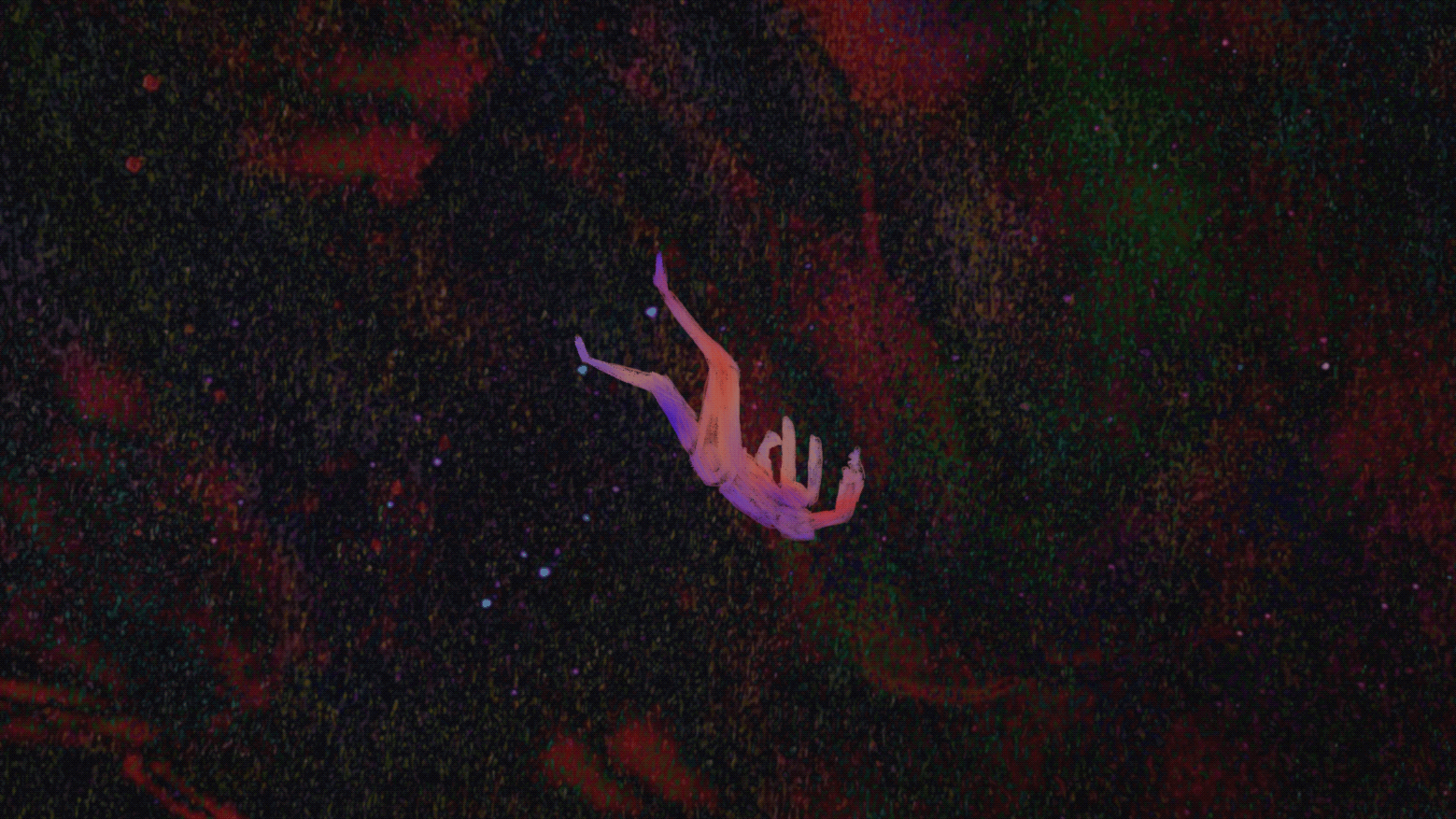
THE VOID
The Void scene marks a critical juncture where the protagonist sinks into a space of overwhelming paranoia and emotions, being met with feelings of self-doubt and comparing himself to other artists. We chose to bring this scene to life with traditional animation for its hands-on approach to create a more intimate connection between the animation and the artists.
-
The visual style of the void is deliberately chaotic, mirroring the instability of the protagonist's mind.
-
The erratic imagery reflects the turmoil within, with each member of our group contributing at least one shot, which enhanced the unfiltered, raw emotion within the scene.
Coloured shot from the film

Early explorations of the colours, digital


Early explorations of the colours, digital
FUTURE
My team and I opened up a crowdfunding for the film and we successfully passed our goal of reaching 3000 Euros. We will use this money for sound design, reimbursing other artists that will and have helped us with the animation clean-up, colouring and backgrounds. We will also use the money for festival admission fees, for the project to reach a bigger audience and act as a launchpad for our careers.
FESTIVALS:
Kino Film Festival (Graduation Show)
Frame2Fame
Wildcard Funding
Playgrounds
Annecy
Animac
Vilnius Short Film Festival
and others..
PLANNED COMPLETION DATE 23 November, 2025
CURRENT COMPLETION STATUS 90%
CREDITS
Director and Script Writer: Alekos Recchia
Producer: Antonina Zhuk
Lead Animator: Priyesh Sadhoe
Art Director: Kotryna Urbanaviciute
Animation: Alekos Recchia, Priyesh Sadhoe, Anya Sharma, Timo Janssen, Francesco Sommer, Talitha Knockaert
Backgrounds: Kotryna Urbanaviciute, Esther Gimbri, Mae McNamara, Olive Vermeulen, Anthony Sedlàk, Maria Al Jajjy
Music Composer: Ed Ranike
Saxophone: Andrea Leone
Trumpet: Simon Beets

